 |
|
 Jun 25, 2006, 02:35 PM // 14:35
|
#81 |
|
Krytan Explorer
Join Date: Jul 2005
Location: Luxembourg
Guild: [FcUK] Forgot The Ghostlyyyyy [WM] War Machine
Profession: W/E
|
|

|
 Jun 25, 2006, 02:57 PM // 14:57
|
#82 |
|
Krytan Explorer
Join Date: May 2006
Guild: Malice Dedication Ambition [MAD]
Profession: Mo/
|
owell, first of all, nice technics ...
dc_ross: imho you overdid it ... for me, the use of blurring is to focus the attention on the sharp part of the pic, not to distract the eye and make it stand out .. you add to many distractions on the char, and the 'shaking' in the background looks rather strange theranger: lloks great imo, but i think you blurred the edgesof the ranger too .. that makes it look a bit strange, one cant rlly focus on a single thing.. eightyfour-onesevenfive: nice, best i've seen here so far ( apart from thread starter :P ) Queen Christie: looks good imho, but your background doesnt fit. the mesmer is dyded black, so taking shot in a dark background steals some of the atmosphere it could have had. imo you should try with a semi alight place ... setting sun, whatever ^^ if not try some green, means hills. @thread starter ( too lazy to look name up ): ofc, very nice technic, unfortunately you dont tell people how you do it. would be a nice move to tell them, after all, they are all quite coming close to yours in time, so you could maybe help some photoshop-newbies out. but awesome pictures i admit, like the one with the back of the warrior. ofc plz note that taste is a thing one cannot argue about... some like it that way, the other ones this way. what i said is meant as an encouragement, and is not criticizing your tast in any way  keep it up 
|

|
 Jun 25, 2006, 02:58 PM // 14:58
|
#83 |
|
Desert Nomad
Join Date: Dec 2005
Location: The Edge
Guild: Tormented Weapons [emo]
|
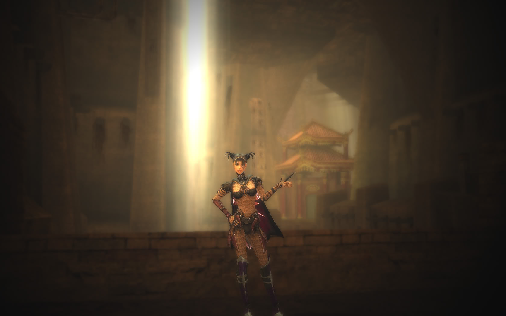
Here's my sad little contribution. Thx for the tutorial Beth....
|

|
 Jun 25, 2006, 03:10 PM // 15:10
|
#84 | |
|
Lion's Arch Merchant
Join Date: Apr 2006
|
Here's my best so far
 -LiamB EDIT: Quote:
Last edited by -LiamB; Jun 25, 2006 at 03:14 PM // 15:14.. |
|

|
 Jun 25, 2006, 03:47 PM // 15:47
|
#85 |
|
Lion's Arch Merchant
Join Date: Jul 2005
Location: Italy
Guild: Dark Evil Angels [DEA]
Profession: W/
|
|

|
 Jun 25, 2006, 03:48 PM // 15:48
|
#86 |
|
Krytan Explorer
Join Date: May 2006
Guild: Malice Dedication Ambition [MAD]
Profession: Mo/
|
eeeks, missed that tutorial, thx for pointing out ... ( just forget the thread starter paragraph :P )
|

|
 Jun 25, 2006, 06:14 PM // 18:14
|
#87 |
|
Lion's Arch Merchant
Join Date: Sep 2005
|
My warr in front of the giant squid. aka Medieval Full Metal Scuba Gear
 Darkened the background to create underwater feel. Darkened the background to create underwater feel.My monk inside droks during last yr's halloween event. Last edited by untitled2005; Jun 26, 2006 at 06:08 AM // 06:08.. |

|
 Jun 25, 2006, 06:18 PM // 18:18
|
#88 | |
|
Frost Gate Guardian
Join Date: Jun 2006
|
Quote:
|
|

|
 Jun 25, 2006, 08:40 PM // 20:40
|
#89 |
|
Wilds Pathfinder
Join Date: Sep 2005
Location: 7°13'35" E - 50°06'27" N
Guild: Servants of Fortuna [SoF]
|
Damn you Bethany for starting this topic! I should be playing the game, instead I'll be taking and editing screenshots all night long!
 Well, here are my next two... click to enlarge. Well, here are my next two... click to enlarge.A Summer Day original: 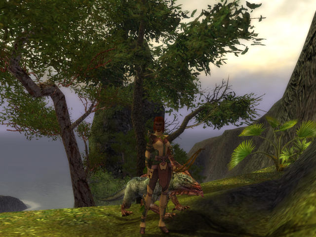 edited: 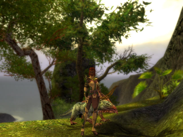 The sky is maybe a little too bright, due to the added light source. Adjusted the colour balance slightly to give it a warmer look. Grenth be Damned! original: 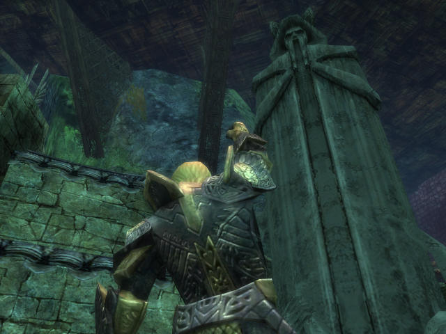 edited: 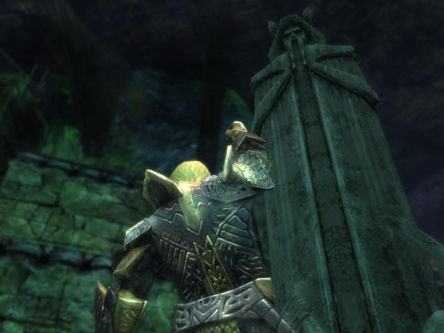 With less prominent dodging on the glossy armor parts this time. I like how it turned out, but it's possibly still not dark enough. It's a shame that the armor skin is distorted like that when performing emotes. |

|
 Jun 25, 2006, 08:54 PM // 20:54
|
#90 |
|
Lion's Arch Merchant
Join Date: Sep 2005
|
Last edited by untitled2005; Jun 26, 2006 at 10:39 PM // 22:39.. |

|
 Jun 25, 2006, 10:53 PM // 22:53
|
#91 |
|
Wilds Pathfinder
Join Date: Sep 2005
Location: 7°13'35" E - 50°06'27" N
Guild: Servants of Fortuna [SoF]
|
Aaand another one... (again, click to enlarge)
C-c-cold... original: 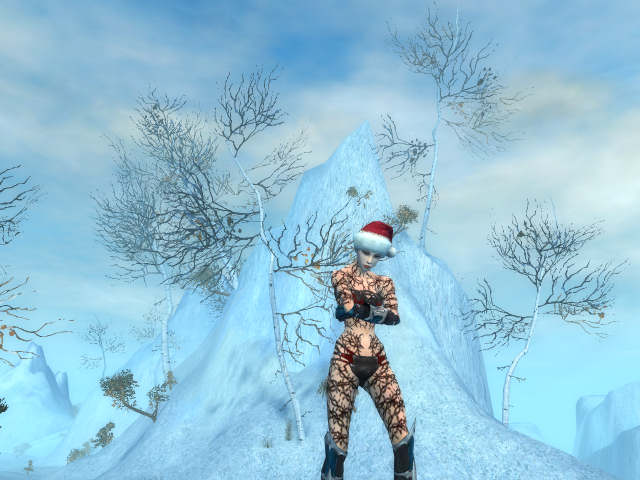 edited: 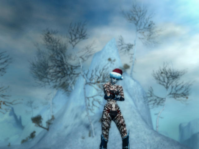 Originally I wanted to have her picture a lot darker, something with a background from the Kurzick area. But her hair is so fuzzy that I couldn't get it cut out cleanly, so I had her put a hat on. Of course you can't make a picture with a Yule Cap in a Kurzick Cathedral...  New version of my first one: Tribute to Grenth original: 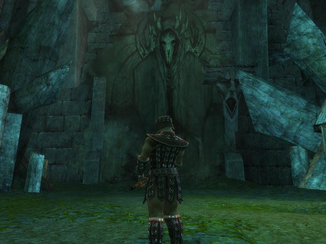 edited: 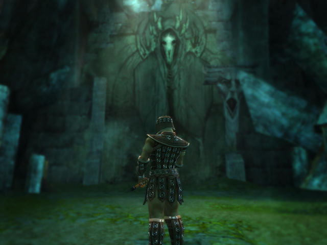 Basically still the same, only highlights and shadows improved. Oh and by the way, WoodyDotNet, you may want to link that picture. I'd say it's a tad big, even for the Screenshot forum. 
|

|
 Jun 25, 2006, 11:09 PM // 23:09
|
#92 |
|
Pre-Searing Cadet
Join Date: May 2006
Location: Georgia, USA
Guild: Exile Knights
Profession: E/Mo
|
My attempt... Added a bit more for effect of "elemental" wanted to add fire but I already resized it too low lol
|

|
 Jun 25, 2006, 11:16 PM // 23:16
|
#93 |
|
Lion's Arch Merchant
Join Date: Apr 2005
Guild: Nova Alliance [Nova]
Profession: R/
|
"Now how did I get shrunken down to the size of a mini-pet..."
Also known as "Honey, I shrunk the Minion Master" ^_^ |

|
 Jun 25, 2006, 11:54 PM // 23:54
|
#94 |
|
Krytan Explorer
Join Date: May 2005
Location: My house
Guild: The True Oni [Oni]
|
Okay I tried my best. I was using PSP so I wasn't able to do the exact same lighting, but I came up with two different endings. One is what it would look like if Le Roma Victor (My beautiful warrior) was a movie star and was in a photo shoot, second, inspired by the OP's ranger, she is getting ready to "enter the storm." Any comments?
|

|
 Jun 26, 2006, 12:28 AM // 00:28
|
#95 | ||
|
Frost Gate Guardian
Join Date: Jun 2005
|
@The ranger: I love what you did, it's great!
Quote:
@Liamb: You've got a great pose and a good background. Now, I can see some areas where you forgot some erasing. The other thing is the Dodge tool at some places is a bit too bright. Keep it up! Quote:
 And for some reason, I can only see the ranger images. And for some reason, I can only see the ranger images. But what I can see looks good, very good. And I really like what you did with the warrior, his armor is very well highlighted. that's in the Catacombs in Pre, isn't it? But what I can see looks good, very good. And I really like what you did with the warrior, his armor is very well highlighted. that's in the Catacombs in Pre, isn't it?@xport7: Good highlighting on the armor but just a bit too much in the face. Remember, the Dodge tool is a tricky thing. Don't hesitate to roll back a few steps to see the difference in some of the changes you make. Selena_Lionheart: I like the background. One thing you could try is to get your character closer to the camera but keep the same pose and background. @bringer di morte: I'm not too familiar with PSP (read: never used it). what you could do is to use the tool most similar to the Burn tool and smudge the sky on the top right. Do it with subtility and your overcast will be perfect. Don't forget that if we can see your character's feet on the ground you must erase some of the area around it. Also, I'm sorry if I didn't reply to some posts because for whatever reason I'm not seeing some. All I can see are the written words and nothing else. But from what I can see, everyone is doing what I planned for this thread: to have fun, show our works, comment and basically help each others out. Bethany |
||

|
 Jun 26, 2006, 12:29 AM // 00:29
|
#96 |
|
Krytan Explorer
Join Date: Jan 2006
Location: I live in Konglevegen
Profession: N/
|
ok here's my attempt on doing this blur effect:
Last edited by bulletsmile; Jun 26, 2006 at 12:33 AM // 00:33.. |

|
 Jun 26, 2006, 12:35 AM // 00:35
|
#97 |
|
Frost Gate Guardian
Join Date: May 2005
Location: Houston, Texas
Guild: Gwen Is [EVIL]
|
My sad attempt
|

|
 Jun 26, 2006, 08:58 AM // 08:58
|
#98 | |
|
Wilds Pathfinder
Join Date: Sep 2005
Location: 7°13'35" E - 50°06'27" N
Guild: Servants of Fortuna [SoF]
|
Quote:
Yes, that's in the Catacombs in Pre on the first picture. But now I'm confused. Which one exactly are you talking about? The original version that I linked on page 4 or this one? |
|

|
 Jun 26, 2006, 09:04 AM // 09:04
|
#99 |
|
Krytan Explorer
Join Date: Aug 2005
|
hmm |

|
 Jun 26, 2006, 11:12 AM // 11:12
|
#100 |
|
Pre-Searing Cadet
Join Date: May 2006
Location: Georgia, USA
Guild: Exile Knights
Profession: E/Mo
|
The only reason it's highlighted that much on the face is to emphasize that the thing on the chest there is actually glowing so-to-speak. (Hence the rendered light flare.)
|

|
 |
|
«
Previous Thread
|
Next Thread
»
| Thread Tools | |
| Display Modes | |
|
|
All times are GMT. The time now is 03:15 PM // 15:15.


 Linear Mode


